Up to this point we have talked mostly about achieving a correct exposure by paying close attention to the intensity of light, but we also need to consider the colour of light and know how to set our camera to capture it correctly by setting a proper “white balance“. The white balance settings available on your camera are basically presets that can be set to match the ambient lighting conditions allowing the captured image to be the proper colour. The colour temperature of light is measured in degrees Kelvin using the symbol “K” which is a standard that provides a means to compare light sources.
Camera’s currently do not have the artificial intelligence to correct for the colour temperature of a scene, this is why we need to understand how to evaluate the lighting conditions and set the camera so it can capture the correct colour. The “white balance” basically ensures that the white in the scene actually looks white.
Typical preset settings are represented by symbols which have specific colour temperatures or ranges of temperatures for general situations.

With “AWB” the camera automatically evaluates the scene trying to interpret an appropriate white point to determine the temperature setting. This method works good for most daylight conditions.
When taking photos in doors it is better to set the white balance using the Tungsten or Fluorescent setting. However, it is important to understand there is a wide range of in door lighting used from a colour temperature perspective, therefore it is best to try a few white balance settings to see which gives the best result. It may be necessary to set a “custom” white balance to ensure proper colour in the captured images. To set a custom white balance it is important to use a calibrated gray card and follow the procedure in your camera manual.
There may be a specific requirement to set a specific temperature, for example, when taking photographs of products. Usually for this situation the colour temperature of the light source is known and you then set the camera to the same Kelvin setting to match.
The setting of the colour temperature is more important when capturing images as “Jpeg” because the colour temperature is directly applied to the image. When capturing images in “RAW” the colour temperature can be changed using post processing but it’s always good to set the right white balance so the image preview on the back of your camera has the correct colour.
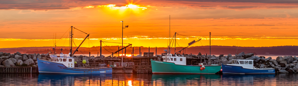
Below is an example of the same image with three different colour temperature settings. The image was taken near a window with daylight lighting, center image 55000K, left image 35000K, and right image 75000K. Notice the left image has a blue tint which is a cooler colour, and the right image has an orange tint which is a warmer colour.

When adjusting white balance for a portrait it is important to maintain the proper colour to match the skin tone, therefore matching the camera white balance colour setting to the match the ambient light is important. For a landscape you have a bit more freedom to make the resulting image cooler or warmer based on how you want the viewer to feel which can be used as a creative adjustment.
In our next lesson we will take a look at the camera mode dial and how each setting will help you collaborate with your camera to have a better chance of getting a good exposure when capturing an image under certain situations.
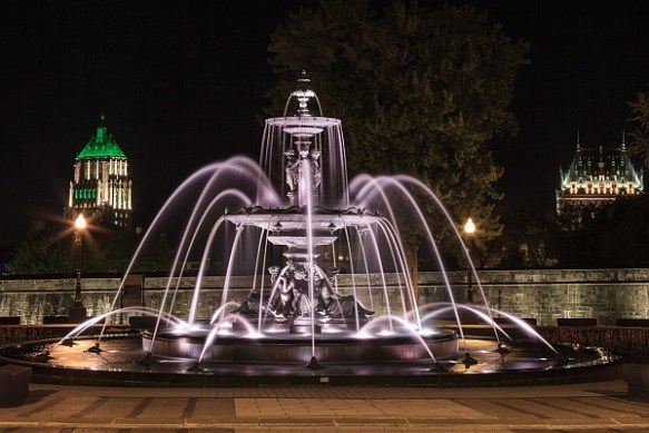
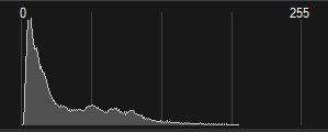
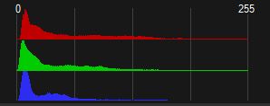
 Viewing the “histogram” for a captured image is a consistent method of determining if it is properly exposed. The histogram is basically a graph of the number of pixels versus the brightness of those pixels in your image. First we will discuss just the “luminance” part of the graph which represents the image brightness scale at the bottom horizontal part of the graph with 0% brightness (black) on the left through 50% brightness all the way to 100% brightness (white) on the right. The number of pixels in the image with their specific brightness’s are shown on the left side scale vertically throughout the graph starting at 0 on the bottom to the maximum number of pixels at the top.